
The Explorer’s Guide to Biology
Designing a better biology learning resource
At A Glance
Design Firm: Wrye Design Lab, LLC
Client: iBiology, Inc.
Client Website: ibiology.org
Time Frame: 32 hours/week over two-and-a-half years
Role: Experience Research Lead and Design Program Manager (This interdisciplinary effort is ongoing, and I continue to work closely with a large team of educators, web developers, designers, artists, and scientists from across the globe)
Date: 01.2018 - 06.2020
Tools: Adobe Suite, Google Suite, Pen & Paper, Optimal Workshop, Zeplin
Services: This long term project has included a large scope of responsibilities including, but not limited to, generative research, evaluative research, design resource management, project management, marketing management, and production schedule management.
Context
iBiology is a nonprofit charity devoted to promoting accessible and engaging biology communication through multimedia storytelling. One of iBiology's newest projects, titled The Explorer’s Guide to Biology (also known as XBio), is intended to replace the traditional biology textbook with a free, accessibility focused, open-source online biology learning platform. This online platform includes narrative-based written content focused on conveying not only the facts but also the story and drama of science, written by leaders in the field.
iBiology partnered with TNQ Technologies, a science publishing technology firm based in Chennai, India, to complete the technical side of web development. I worked closely with the TNQ team throughout my time with iBiology.
Initially, iBiology engaged me to complete generative and evaluative design research for the content and interface of the new platform. Later, the scope of my work was increased to managing all aspects of experience design, then again increased to include coordinating information exchange between the content, design, and web development teams in order to ship a minimum viable product on schedule.
All design artifacts in this portfolio are the property of iBiology, Inc, used with permission or under a CC-BY-NC license.
Initial Generative and Evaluative Research
Building empathy through user research is essential when designing any system. This proved especially apparent for XBio from the very beginning because of the multi-stakeholder reality of the traditional education system: even though students are intended to be the beneficiaries of education, no education resource can reach a student without first being adopted by an educator.

As an education resource intended for use in traditional higher education, XBio would therefore need to not only augment and improve learning for students, but also provide enough of an incentive for educators to adopt it. We decided to move forward with a qualitative research effort with undergraduate students and their educators. This research included two prongs for each user population:
Generative Research: This research focused on generating empathy with users and understanding their point of view, needs, goals, and values. The information garnered from this effort would be used to inform all future design work and strategic choices.
Evaluative Research: This research focused on evaluating some of the written content already created by the XBio team. These pieces had been written as a set of proofs-of-concept, and would be great targets for thoughtful evaluation with both students and educators.
Image of the Squarespace-based online narrative prototype used by educators and students in evaluative content research. I used Squarespace for this prototype because I was familiar with the tool and could therefore quickly and easily create and edit the prototype as the need arose.
We recruited 7 educators and 17 students willing to sit down with me for an in-depth interview. In an effort to gather insights from students and educators across the educational spectrum, these students and educators were drawn from UC Berkeley (a highly ranked public university), San Francisco State University (a mid-level public university), and the City College of San Francisco (a free community college). Before the interview, students and educators were asked to read one piece on an online content prototype (made with Squarespace) built to simulate the online reading environment as closely as possible. The interview portion of the research lasted between 30-60 minutes, and included:
Generative questions: Open ended questions about the student’s or educator’s experience with textbooks and in the classroom.
Evaluative questions: Open ended questions regarding the student’s or educator’s experience with the content prototype.
Key Takeaways For Students:
The generative portion of the research uncovered five key takeaways for students:
Students actively find ways to annotate their texts, whether digital or physical.
It is important to students to understand how far along they are in their homework.
Students complete their textbook reading in all sorts of environments (loud/quiet/etc.).
Sometimes students read their homework all the way through in one sitting, sometimes they break it up into multiple sessions.
Some students like to read on their laptop, others far prefer to print their homework out onto a physical format to read.
In the evaluative portion of the student research uncovered four more:
Students reported enjoying reading the narrative.
The students often did not finish the narrative in its entirety, citing that it was too long or that they had too little time in the context of other classwork.
Some students felt like the scrolling nature of the content made it seem like the content would never end (they were used to knowing how many pages they had left in their textbook). Other students appreciated the long scroll, as they were used to similar systems online.
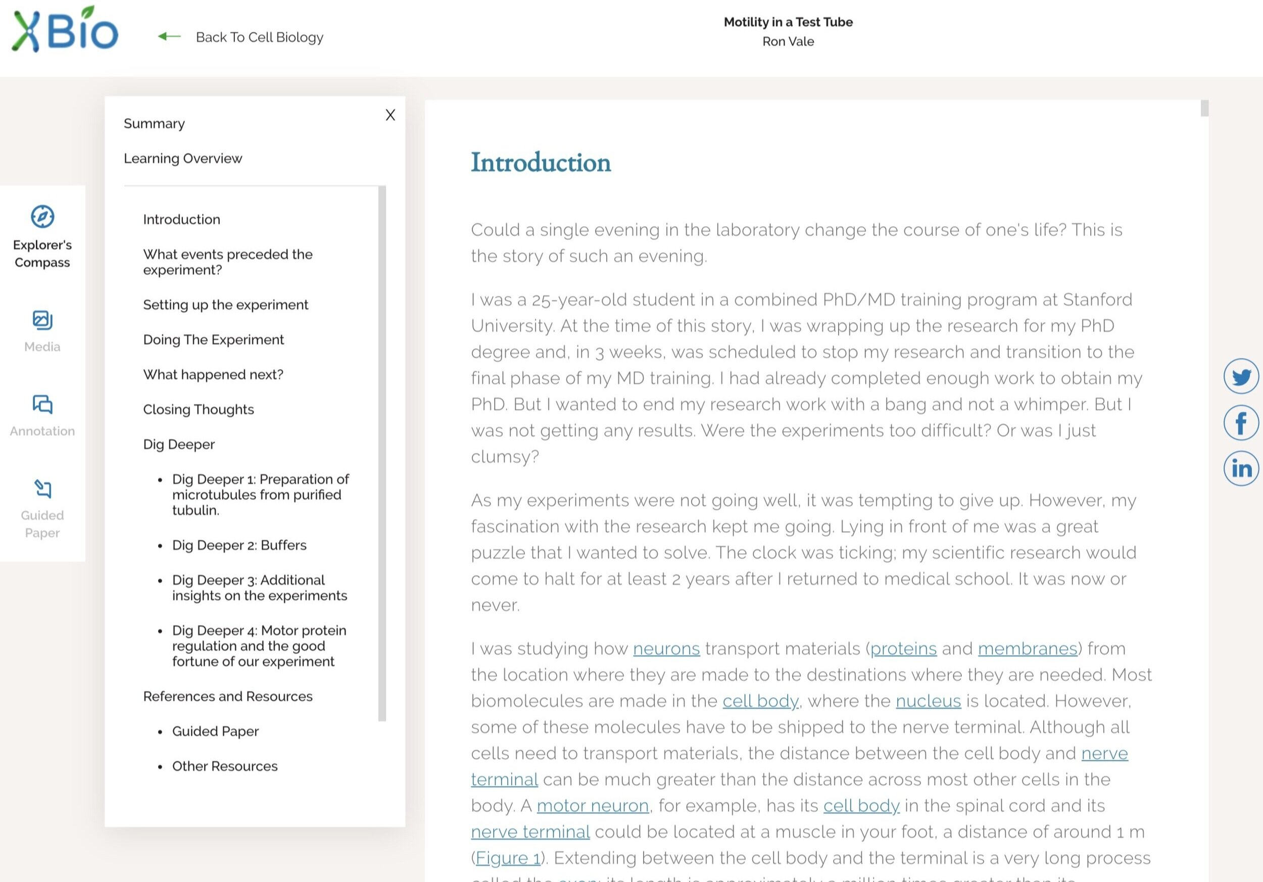
Students conveyed that they appreciated how the content was organized, and how that organization was communicated. Students especially appreciated “The Explorer’s Compass,” a piece of narrative in which the most important information from each section is presented in a bulleted form. Students reported this was especially useful, because they knew what they needed to pay special attention to in each section.
Key Takeaways For Educators:
The generative section of the research uncovered five key takeaways for educators:
Educators often have administrative pressure placed upon them to teach certain material. For instance, the AAAS’s Vision and Change initiative was often cited as a framework that educators were required to use in their course planning.
Textbook companies provide a range of educator tools, such as test questions and slides. Many educators use these resources heavily, although they like to customize them to some degree.
Educators are aware and concerned about the burden high textbook costs impose on students.
Educators rarely follow the order of material in textbooks (they may start with Chapter 1, then move to Chapter 5, then Chapter 21, and so on.)
Educators use online tools to communicate with their students.
In the evaluative portion of the educator research uncovered two more:
Educators reported that they appreciated the way the narratives portray the process of science.
Educators reported that they were concerned about the length of the narratives, and were not sure how the narratives would fit into their current class or homework structure.
Research-Based Ideation & Strategy
Using my research findings, including the key takeaways outlined in the prior section, I worked with the founder and editor in chief (and other members of the team in certain cases) to identify features that would make the XBio content and platform an ideal learning resource for both students and educators.
Annotation: an online annotation tool for students who annotate their text.
Bookmarking: a way for users to return to where they left off, should they spread their reading homework across several homework sessions.
Educator Tools: exam questions and class slides for educators.
Groups: a mechanism for educators to and students to interact and communicate with groups of other educators and students.
Intra-Narrative Modularity: narratives would have a standard set of modular sections, which can be used in any order or on their own.
Progress Tracking and related Navigation: as an online tool, there are no page numbers with which to base organization and narrative location. XBio therefore needed a way for students and educators to identify a location within the narrative. This ended up being served by a semantic navigation system (more in the next section: Low Fidelity UI Design).
Typeset PDF versions of written content: Some students and educators noted that they simply did not enjoy reading educational material on the web. Also, we realized that certain user populations exist around the world that may not have regular access to a computer or the internet, but may be able to print or download written content. We therefore decided to add typeset PDF versions of the content to the platform that could be downloaded and read offline or printed.
User Collections: Many educators suggested that they don’t use chapters in a book in order. User collections would allow users to organize written content however they would like, essentially creating their own textbook.
XBio Curated Collections: Some educators also indicated that they appreciate some sort of structure around which to build a class, and often that structure comes from a textbook. To serve these educators, we would have immediately available curated collections of XBio content focused on certain subfields of biology (ie. genetics or cell biology).
Organizing it all:
These features, as well as the content that already existed, constituted the basic elements that then would need to be organized into a logical information architecture. To develop the IA, I created a card sort study to send out to our educators, the results of which served as the basis for creating XBio’s original information architecture and sitemap:
Dendrogram from the card study sent out to educators.
Early XBio sitemap.
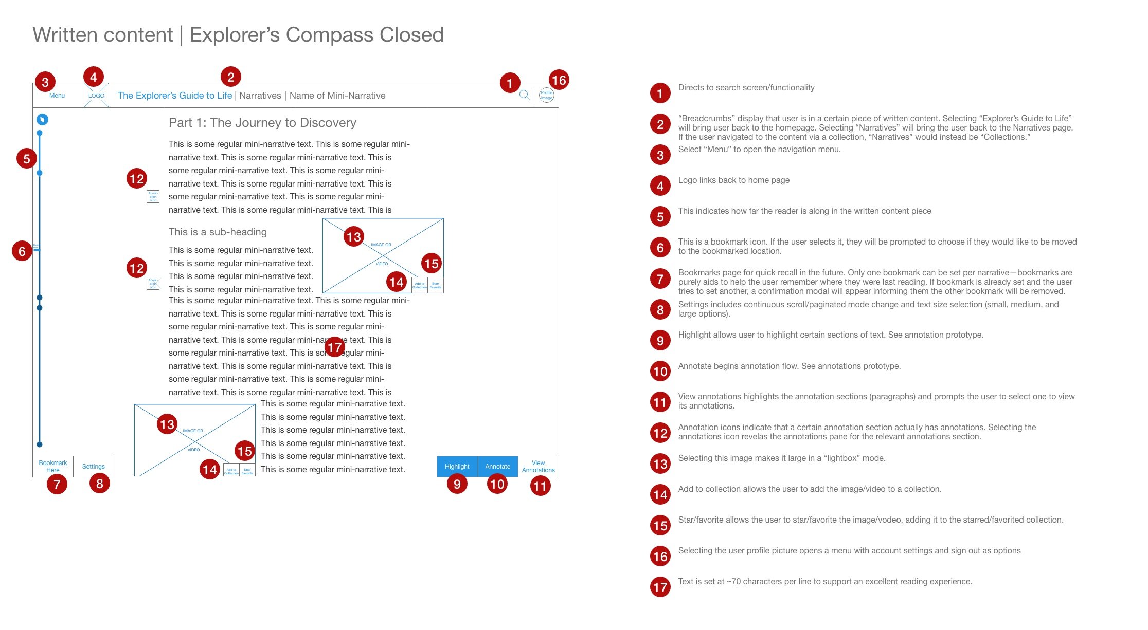
Low Fidelity UI Design (Wireframing)
My clients at iBiology wanted to move as fast as possible to website development in order to get a minimum viable product to educators and students quickly. iBiology’s partner, TNQ Technologies, was slated to perform all web development, however, I was asked to develop a set of wireframes, that would later be turned into high fidelity mockups, to serve as the basis for the site. Hundreds of wireframes of various fidelity were produced over the course of several months. Below is an example of the sort of thinking that lead to the wireframe for the reader:
Original reader design given to me by iBiology. This is not my work, but rather served as a jumping-off point for further iteration.
Reader Design Example: A Jumping-Off Point
Given that most of XBio’s content is written, I decided that a good reader design should be the basis around which the rest of the website would take form. iBiology had an artist who had already taken a crack at a design for the reader. This design, while beautiful, had a few serious usability and accessibility oversights, and would be difficult to translate into an online environment effectively. Still, stakeholders within iBiology appreciated the aesthetics of this mockup, and I was therefore asked to use this work as a basis for the wireframes.
Reader Design Example: Creating the Navigation Bar
One important oversight in the original mockup from iBiology was the lack of a perceivable site-wide navigation system. Creating a navigation system became my first priority when approaching the reader screen, and I made two decisions:
Use of drawer-based menus: In the reader, as much space as possible needs to be reserved for the text and embedded media. Progressively disclosing navigation information through the use of drawer-based menus would minimize the space needed to otherwise display that information, leaving space free for the text and reducing the distraction from navigation elements. A selectable “menu” element would suffice in the navigation bar.
Use of breadcrumbs: Breadcrumbs are touted in human-computer interaction circles as excellent aids to navigation and usability which are not used often enough. I decided to include breadcrumbs as an easy way to communicate a user’s location within the website, as well as the title of the current page.
The first iteration of the navigation bar was built out of the above two foundations.

First iteration of the Navigation Bar. Blue in a wireframe indicates a selectable element.
Further iteration on the navigation bar lead to a second version, with the addition of an area for profile management or “log in/sign up.” This design also removes the redundancy of the logo and “The Explorer’s Guide to Biology” in the breadcrumbs (both would have lead to the homepage). Also note how all navigation-related elements are concentrated to the left of the page, where all personally-related elements are to the right:

Second Iteration of the Navigation Bar. Blue in a wireframe indicates a selectable element.
Reader Design Example: The Downward Scroll
Adopting vertical scrolling, instead of pagination, was a team wide decision: In the user research, students had reported mixed feelings about scrolling action to view more text (as opposed to having pages). Several students reported feeling familiar with the scrolling model, as it reflected most of the rest of their online text consumption. The main complaint about the scroll was that it felt endless, an issue I believed could be remedied using semantic navigation. These two facts, in addition to our developers reporting that scrolling would be easier to implement, led the team to settle on a downward-scroll for the reader.
Because scrolling occurred vertically, all visual metaphors about location or procession through the material would be oriented vertically as well.
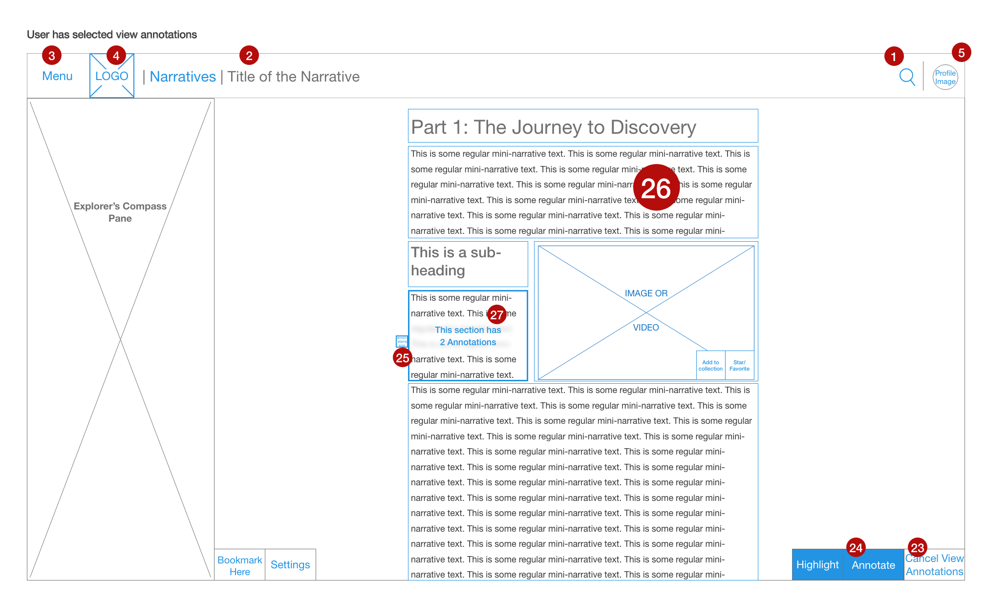
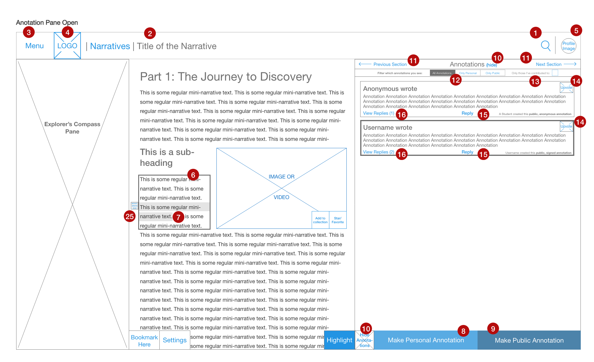
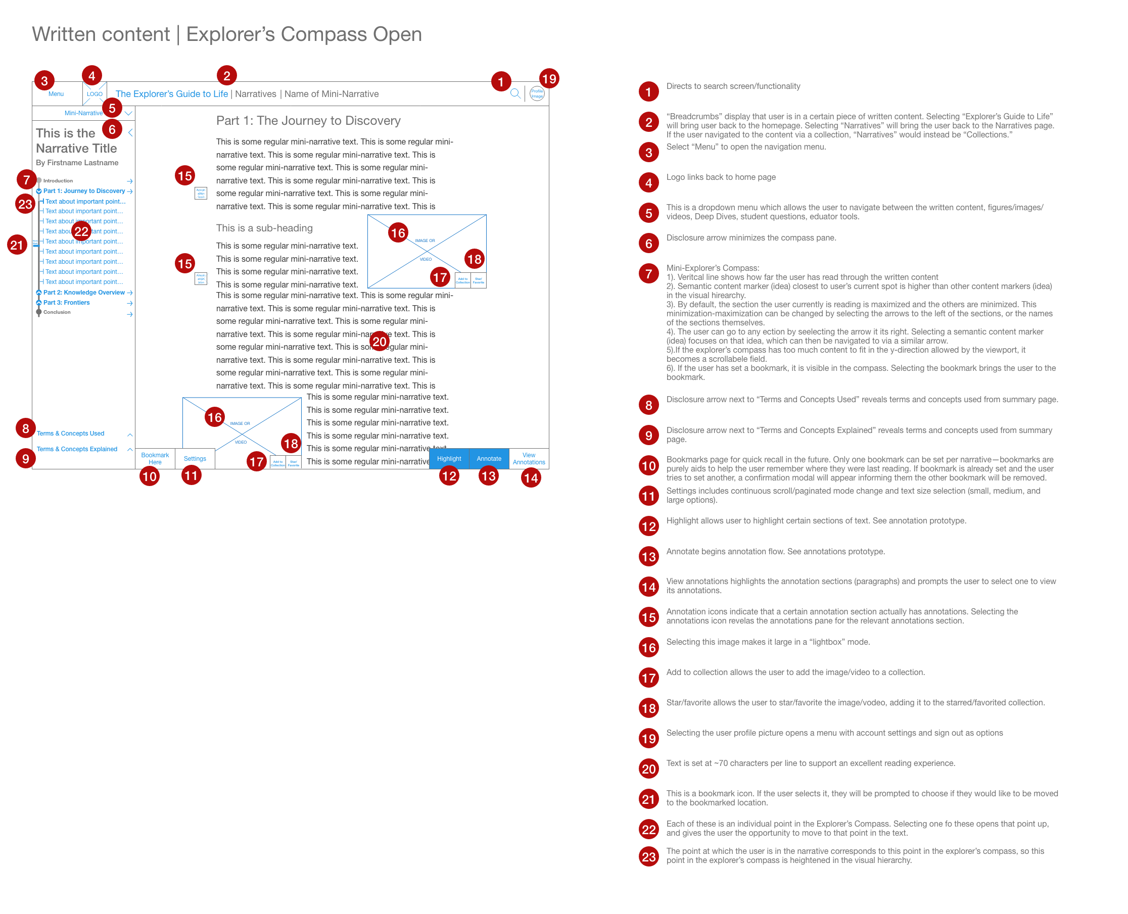
Reader Design Example: Semantic Navigation (The Explorer’s Compass)
XBio content included a section called “The Explorer’s Compass,” which was intended to explain the most important points in each section of the content in the order in which they were conveyed. When considering possibilities of how to include The Explorer’s Compass into the website design, I realized that it could be used to organize and navigate through the written content. Instead of using pages (an arbitrary consequence of the book as a physical system for storing written work) to mark one’s place in the story, one could use the actual, semantic features within the narrative to mark one’s place. I called this feature “semantic navigation,” and it came with the following advantages:
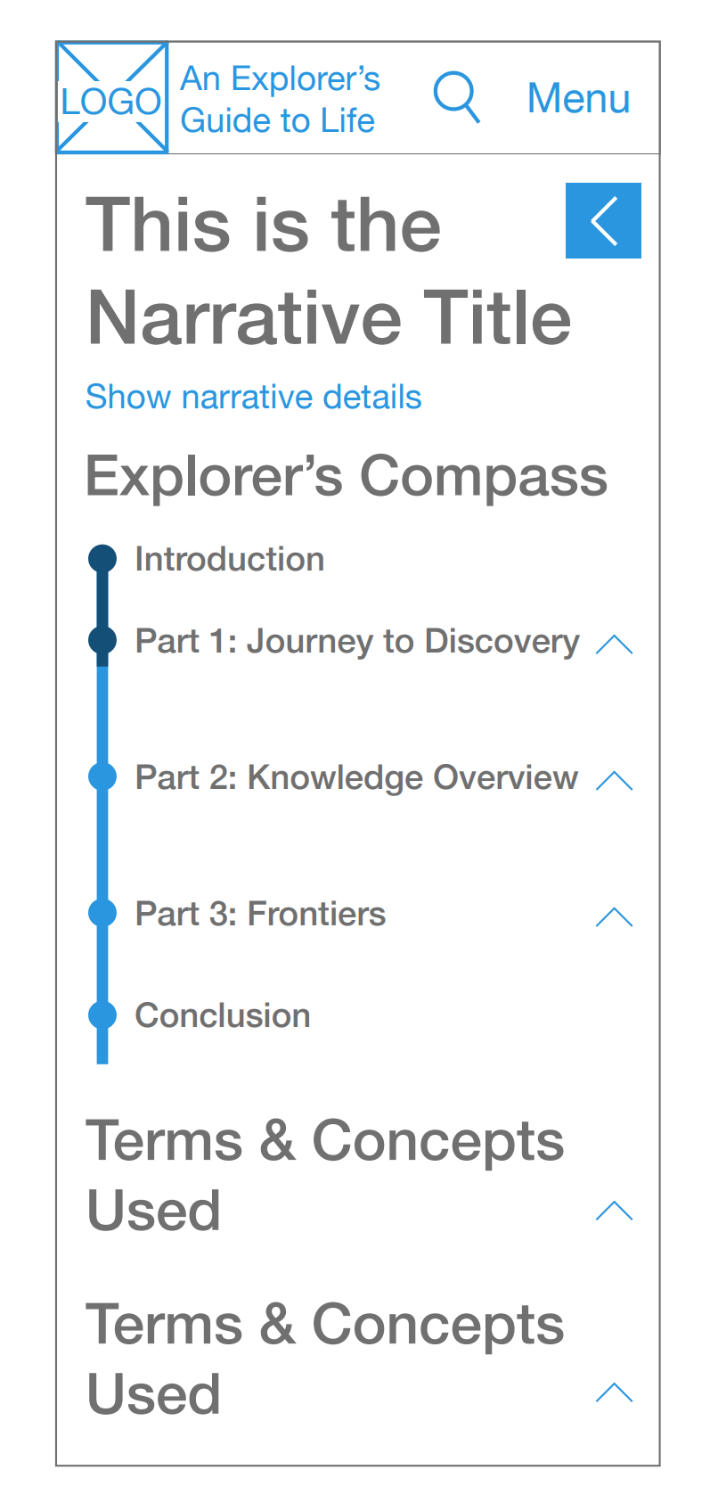
Semantic navigation could stand in for “pages” as students tried to understand how far they were in their homework (a behavior that had come up repeatedly in our user research). For instance, students would know how many core pieces of knowledge they had left to learn about, instead of how many pages they had left to read.
Semantic navigation works whether you use a paged or scrolling mechanism for reading.
Semantic navigation helps students understand what information is most important to understand in a certain part of text (a positive effect of “The Explorer’s Compass” reported by students in our research).
Students can use semantic navigation to easily return to a section of interest—no more “uh, where did I read that… let me flip through my textbook and try and find it” situations.
The Explorer’s Compass was designed to work alongside the narrative progress indicator. This indicator would visually demonstrate how far the user is in the narrative, and show the location of large structural changes in the narrative (such the beginning of Part 1, Part 2, and Part 3). The Explorer’s Compass also was designed around progressive disclosure—there was too much information to display at once in a single screen, so some needed to be hidden when appropriate. For instance, the finer points of information in each part of the narrative would be hidden when the user was not reading that part of the narrative, but could be accessed with a disclosure arrow.
Two early wireframes of the Explorer’s Compass are shown here. Note that blue indicates selectable elements in a wireframe.
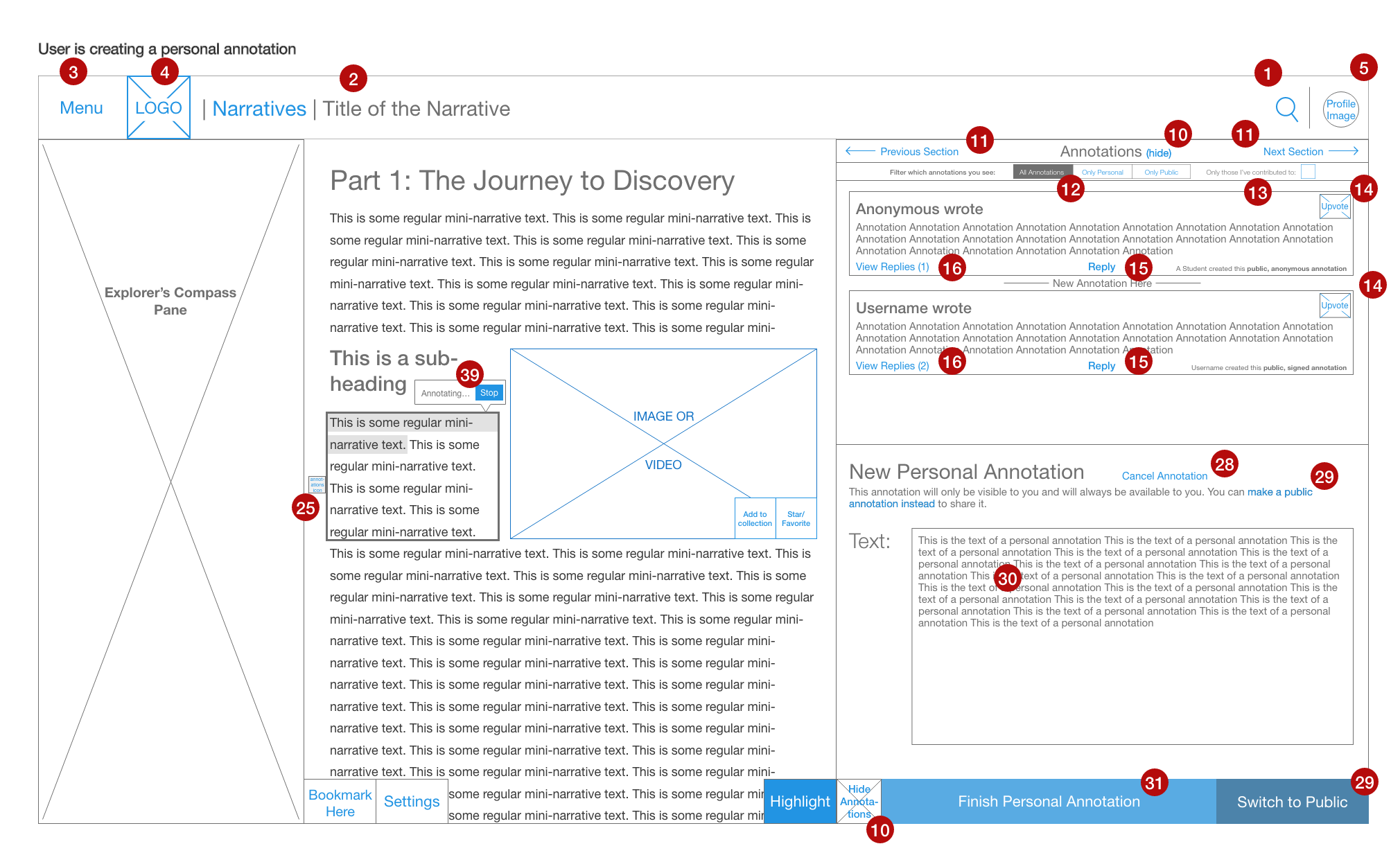
“Personal” Annotation Wireframe. Blue in a wireframe indicates a selectable element.
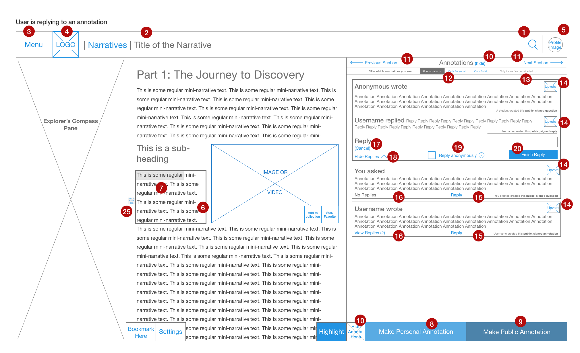
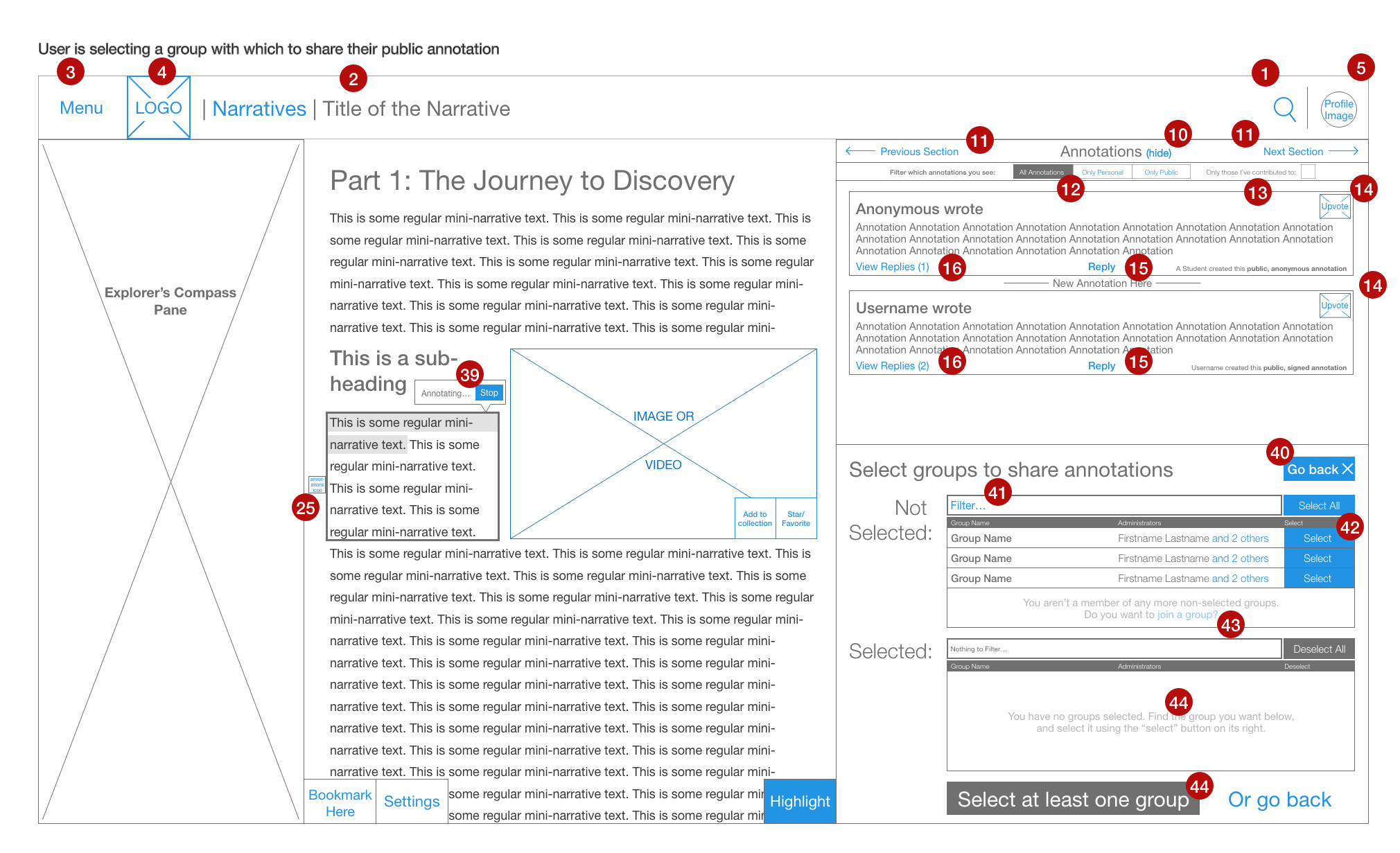
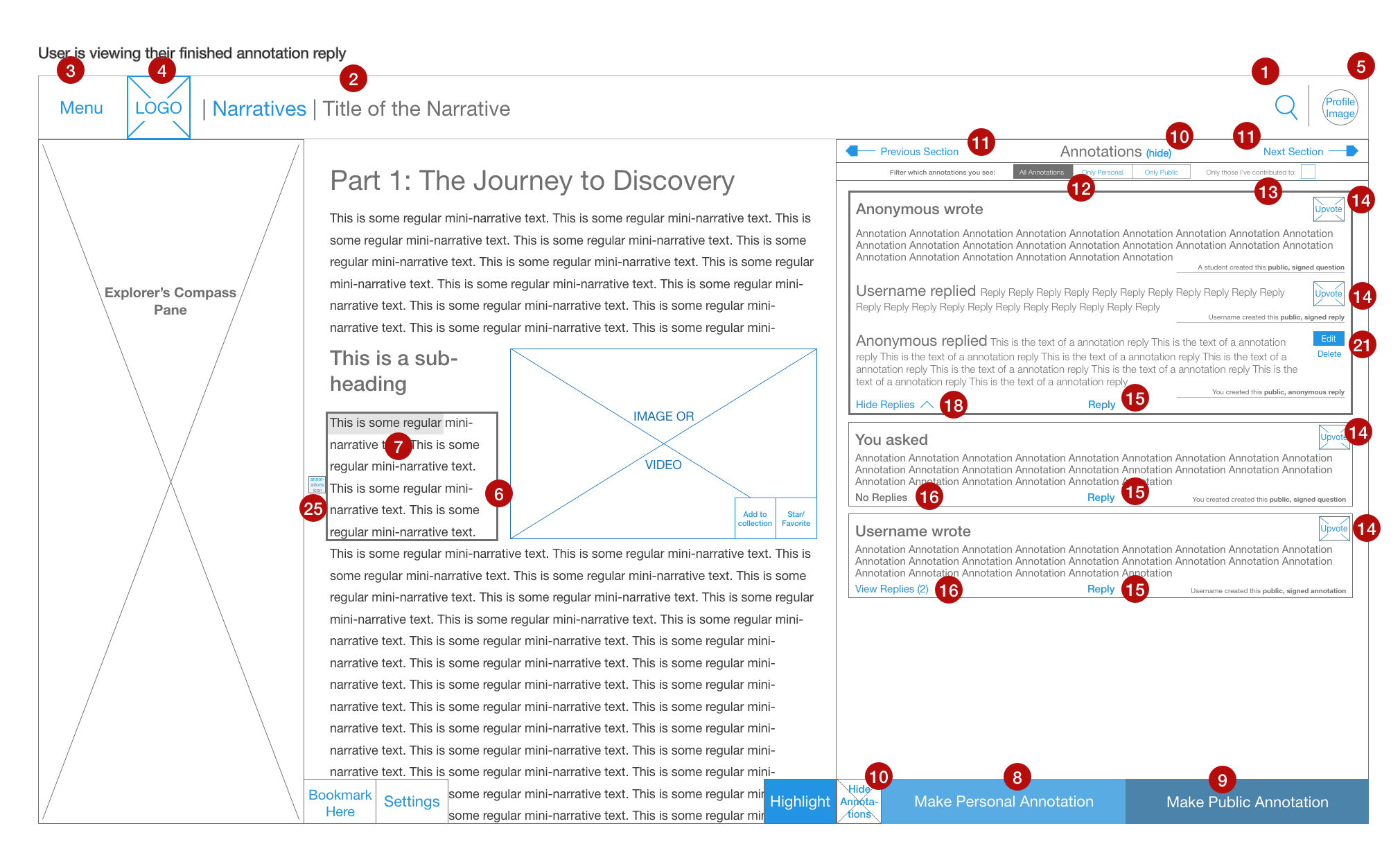
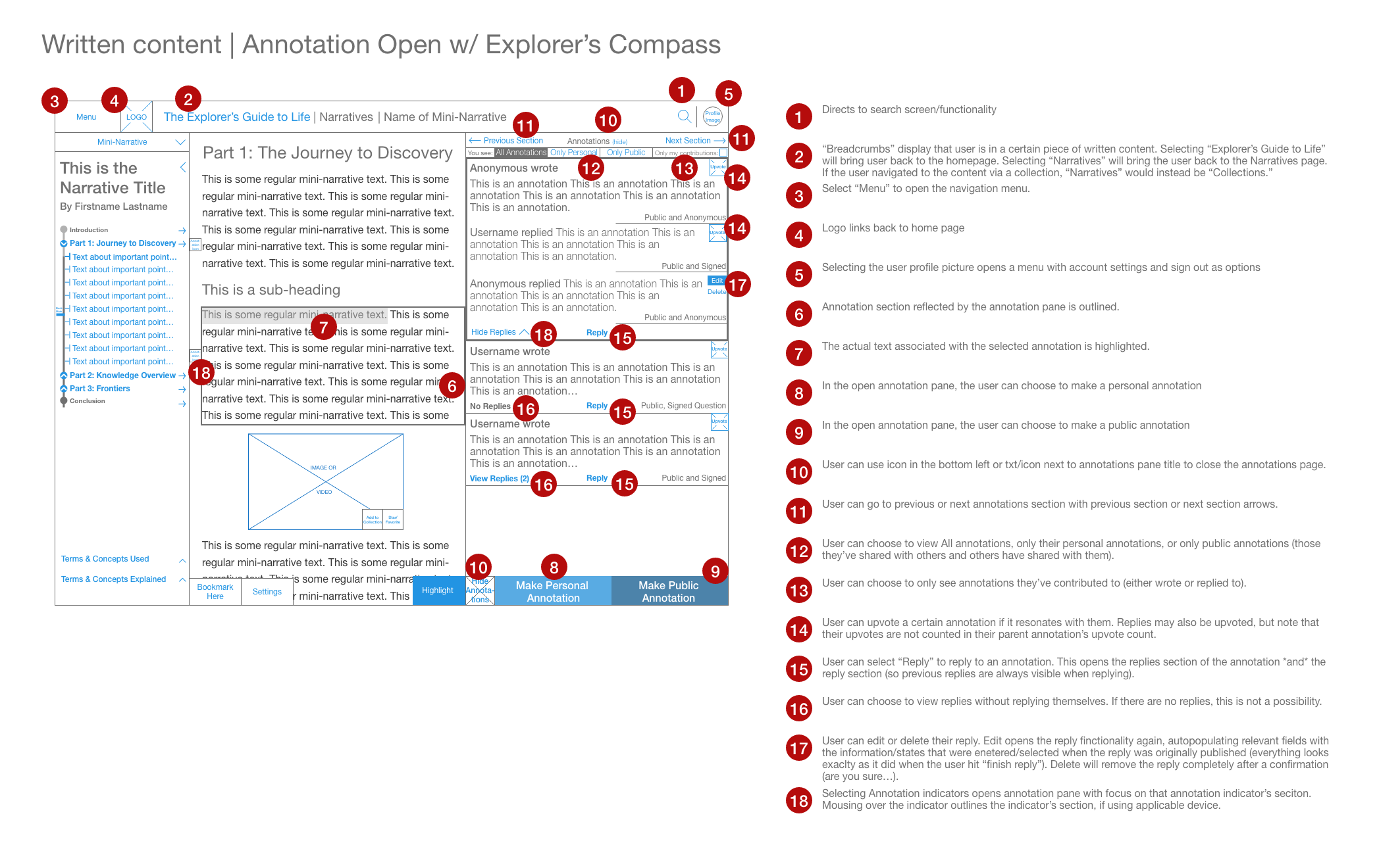
Reader Design Example: Annotation
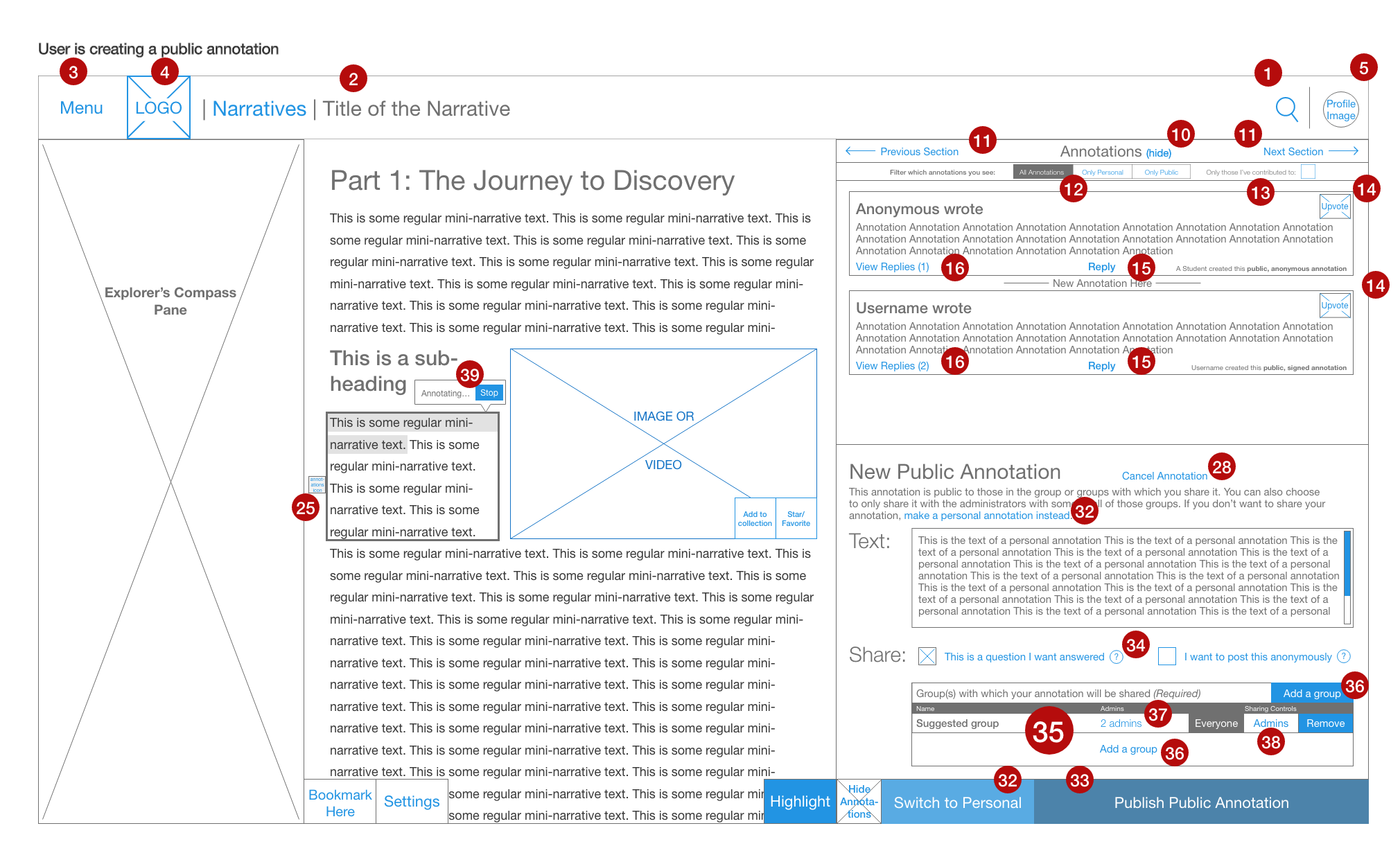
A high percentage of the students who took part in our user research reported annotating both their digital and physical texts. Therefore, building annotation into the reader was a high priority. The early design for this annotation system was inspired heavily by Nota Bene Social Annotation Tool and hypothes.is. Annotation was designed to be public to an XBio group (to begin a conversation about the content) or private (for personal learning and note-taking). I also elected to give users the opportunity to create public annotations anonymously due to the concern that a student may be uncomfortable to ask a question via public annotation if they felt they should already know the answer.
I also designed in an “annotation indicator,” which would indicate if any annotations had been made in a specific area of interest (defined as a paragraph or image). This was necessary to inform the user of the presence of annotations and avoid the overcrowding of indicators that could occur in a particularly thoroughly annotated part of the text.
I created a limited prototype to communicate the annotation system to the developer team and other stakeholders. The gallery below shows a full set of wireframes demonstrating the annotation feature. At the end of the gallery, there is a page with the text corresponding to each numbered annotation. You may view the annotation prototype to gain a greater understanding of the annotation system. Note that blue in a wireframe indicates a selectable element.
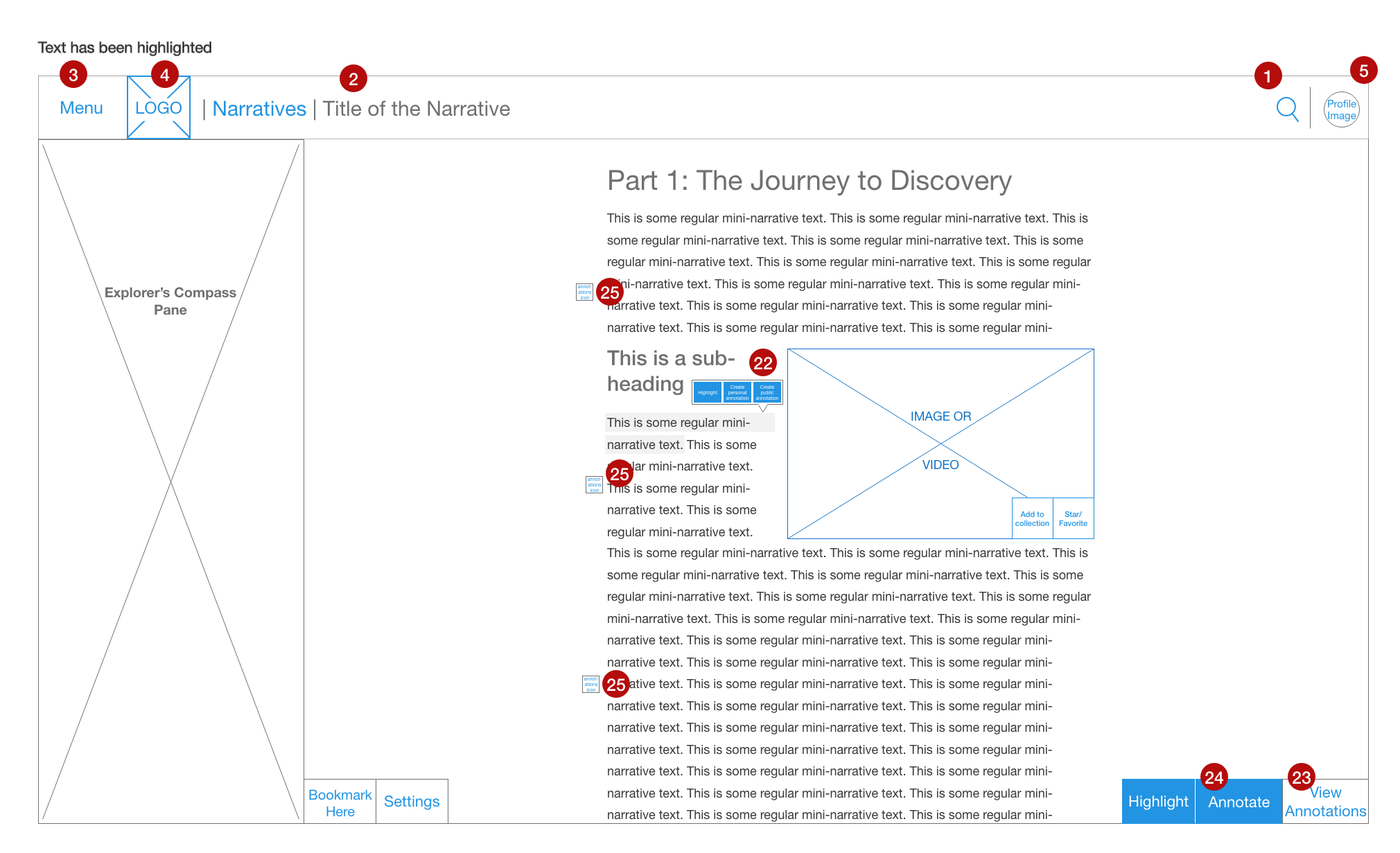
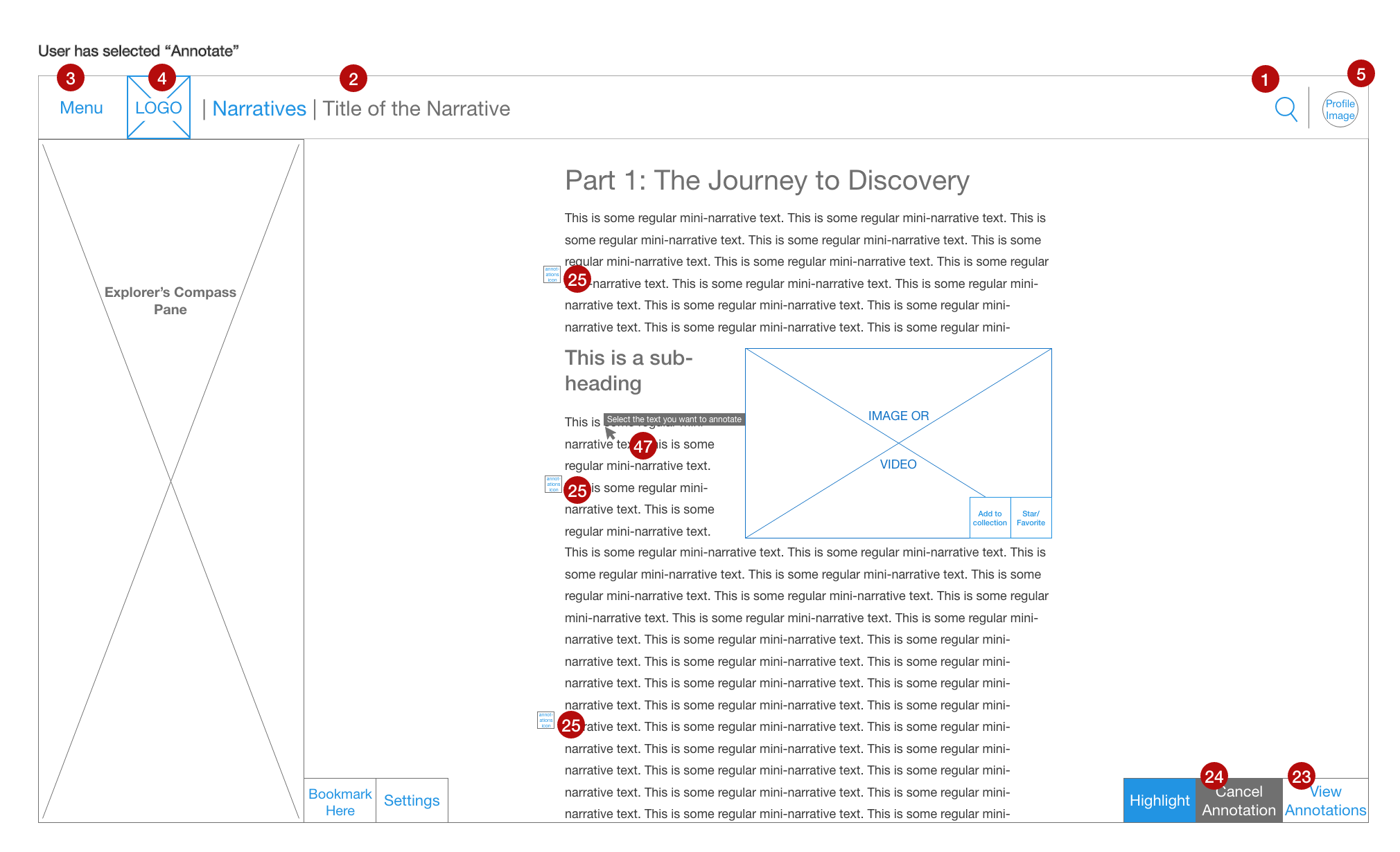
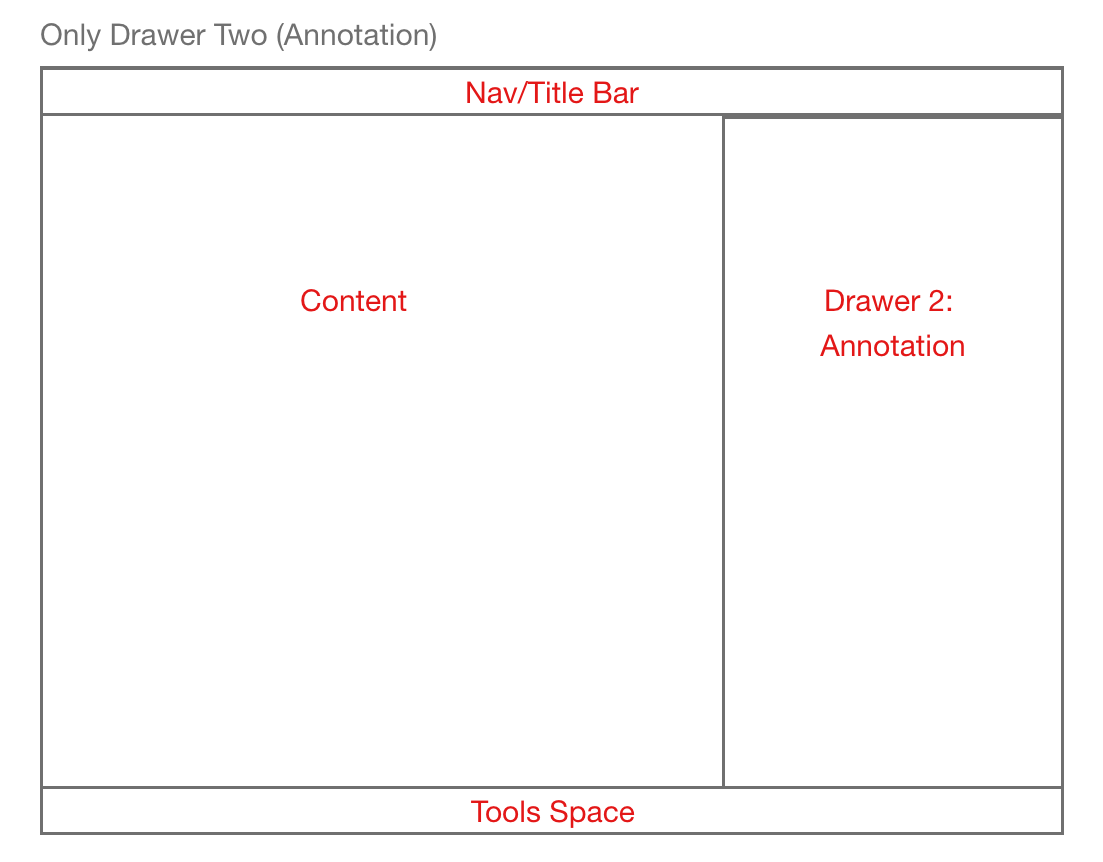
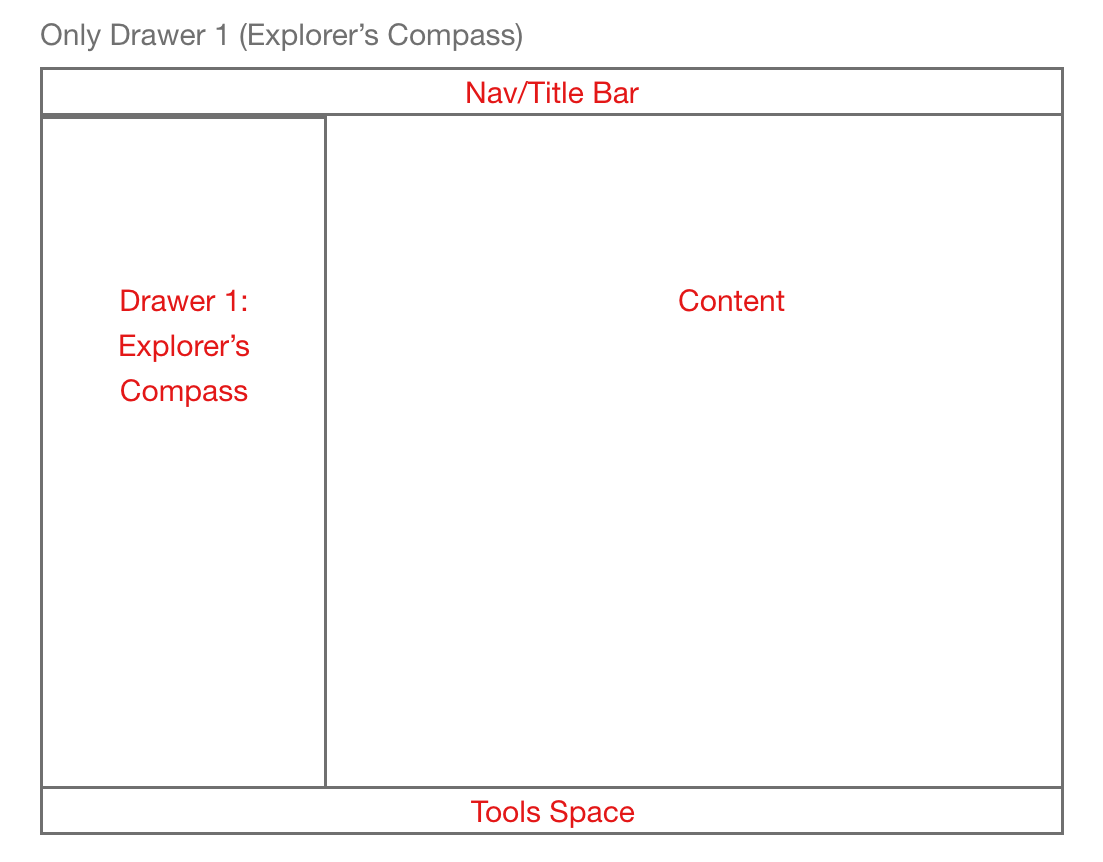
Reader Design Example: The Two-Drawer System
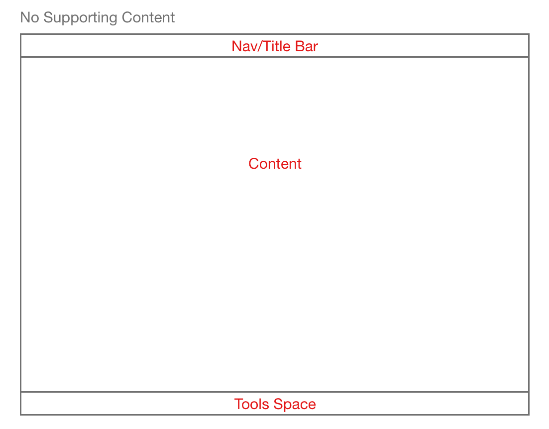
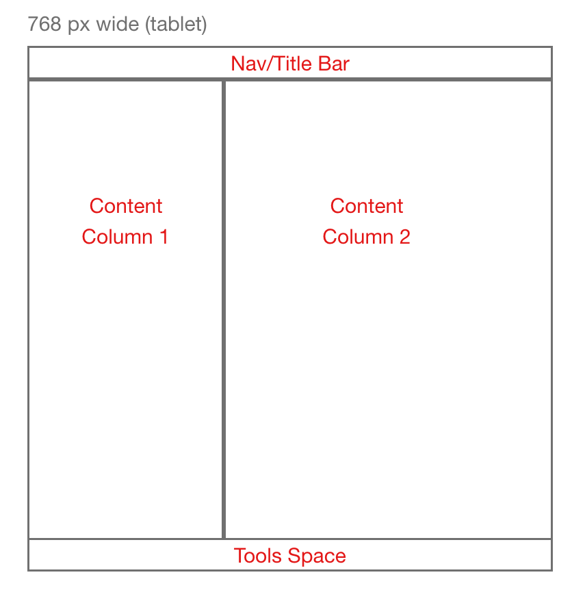
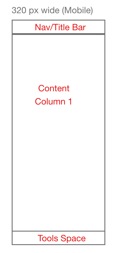
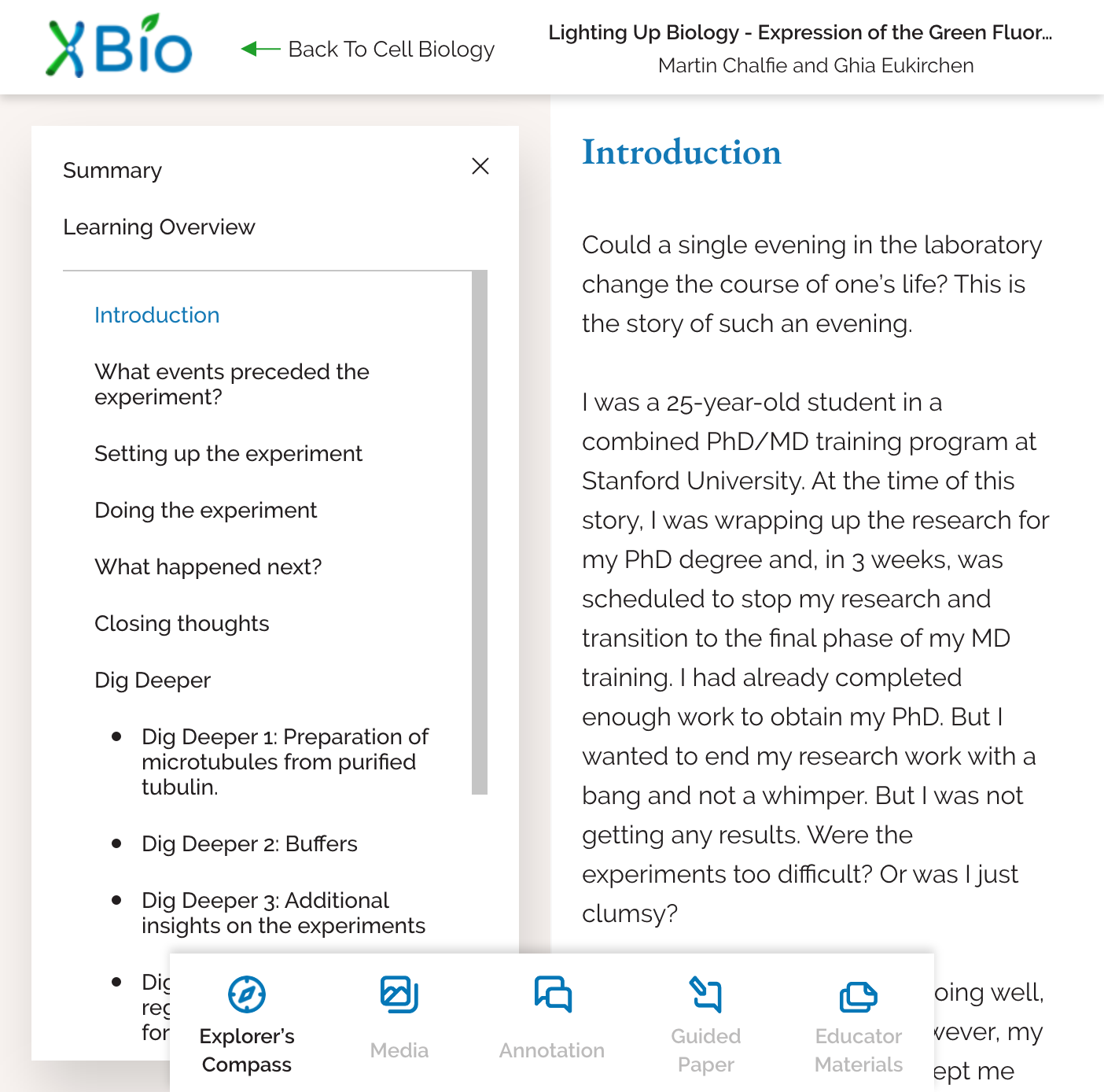
One of the central themes of the reader design was a concerted effort to make a large amount of supporting content, such as annotations and The Explorer’s Compass, immediately available while retaining the potential for a low-distraction, low-clutter reading environment. The interface also needed to be developed responsively, so it could work with any (reasonably) sized screen and would downsize gracefully. As the Explorer’s Compass and Annotations Systems were being designed, this two-drawer system with three possible content columns emerged out of the design limitations as an effective system for:
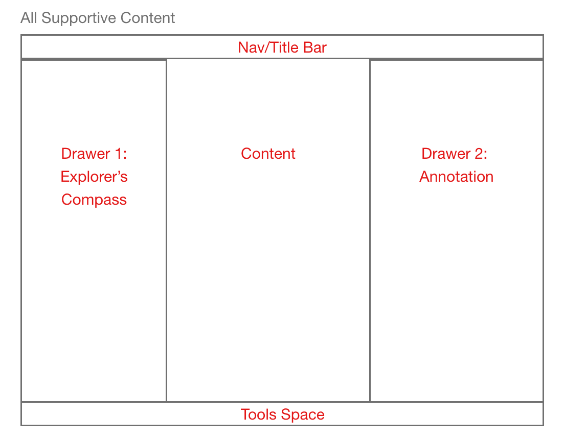
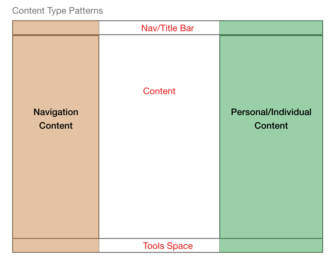
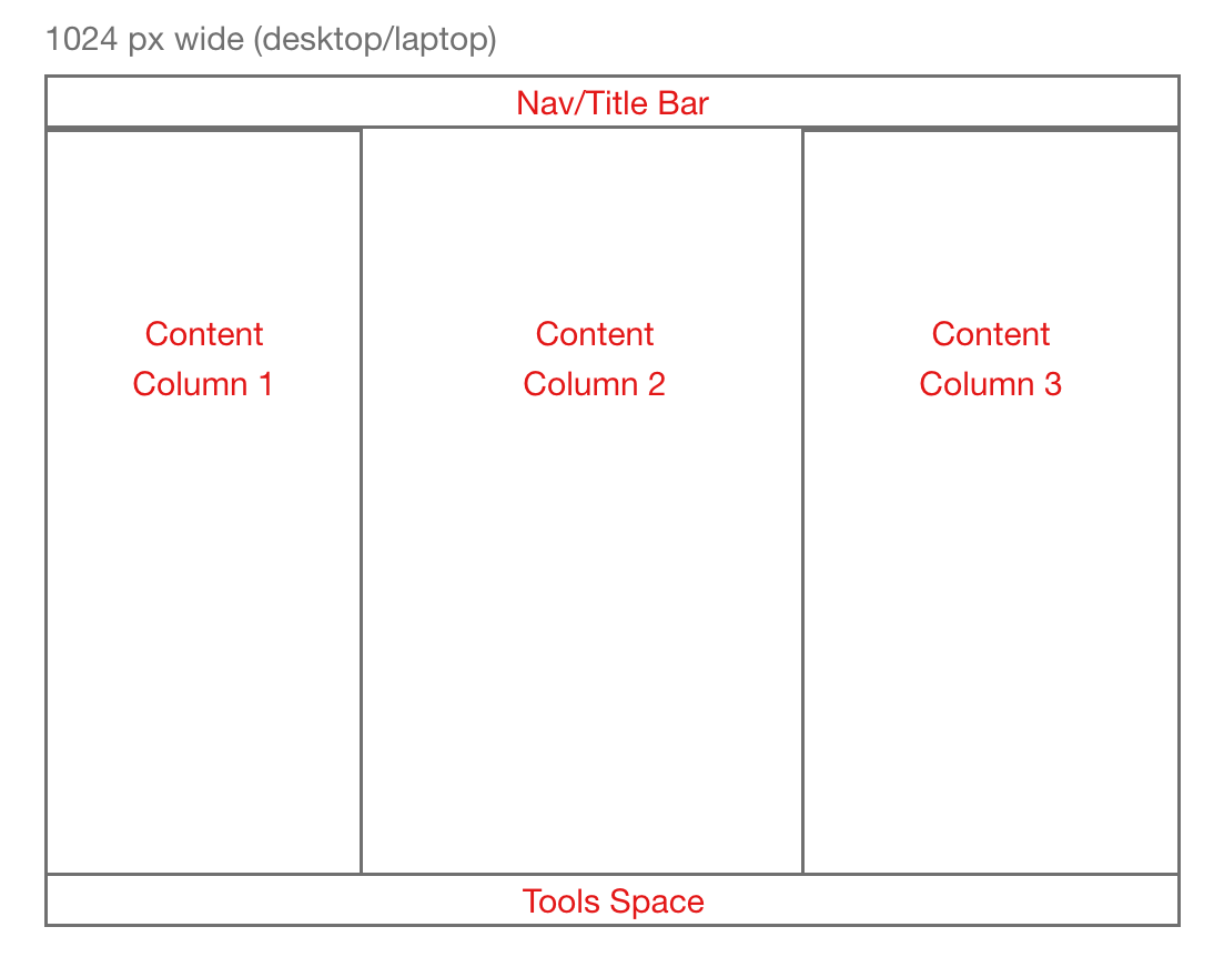
Progressively Disclosing Supporting Information: The two-drawer system allows users to view as much supporting content as they choose at any one time. Does a user heavily use the Explorer’s Compass? They can keep it open all the time (on a large enough screen), even if they choose to create an annotation. Users also have the flexibility to close both drawers for a distraction free reading experience. The “Tools Space” at the bottom of the viewport contains whatever elements might be necessary to open or close the drawers (view annotations, etc.) as well as other elements needed to interact with the content (such as content settings).
Gracefully Downsizing: As the screen gets too small to support three columns, the interface can downsize to two columns (content and either annotation or The Explorer’s Compass). Then, as it gets too small to support two columns, it can downsize to one (either content, annotation, or The Explorer’s Compass).
Thematically Merging UI with the Navigation Bar: With the two-drawers system, all elements regarding navigation are located on the left side of the screen to mirror the navigation menu and breadcrumbs on the nav bar. All personal additions to content, such as annotation, are located on the right side of the screen to mirror the location of the profile information in the navigation bar. This creates a larger thematic organization to the interface, increasing learnability and understandability.
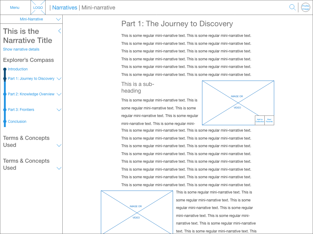
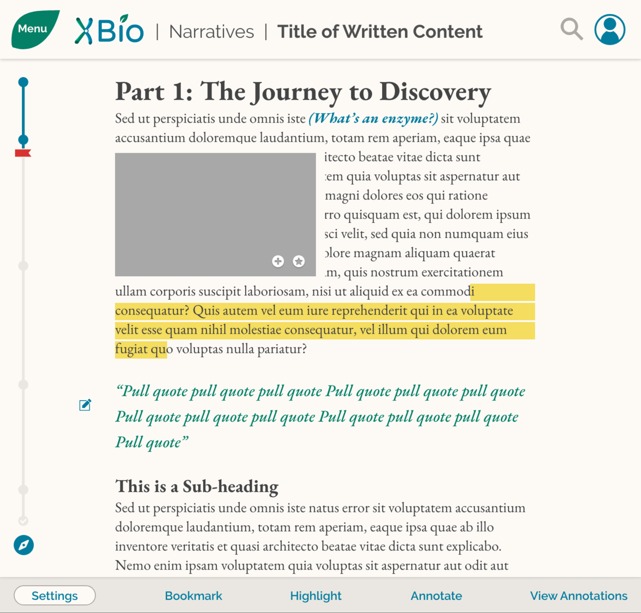
Reader Design Example: Final Wireframes
A few examples of final annotated wireframes for the reader:
High Fidelity UI Design (Mockups)
Since iBiology and the TNQ Technologies developer team wanted to move quickly, I helped iBiology hire a visual designer to work with to turn my wireframes into high fidelity mockups. I suggested bringing someone else on for two reasons:
I had very little visual design experience at the time, so I was not sure if I would produce quality visual design work.
High fidelity mockups needed to be created as wireframes were still being finalized, a process already consuming a large portion of my time.
The visual designer I suggested was a former co-worker of mine, Jimmy, with whom I had worked well in the past. He came from a formal graphic design background, and had recently moved in the visual design and UX direction. I was confident that we would be able to communicate effectively and easily, and that he would produce excellent work. During his tenure with iBiology, Jimmy worked almost entirely under my direction. Our co-development process for high fidelity mockups followed this progression:
First, I deliver a “final” wireframe:
First, I would deliver an annotated wireframe to Jimmy, such as this one. Sometimes, as was the case with the reader, the “final” wireframe would change as requirements from iBiology or TNQ shifted.
Second, Jimmy creates an initial mockup, and together we would iterate:
Jimmy would send me an initial mockup, which I would then reply to with corrections or changes. These changes might be due to accessibility, functionality, or aesthetic concerns. Early in design changes may also have been made to the wireframe at the request of iBiology—I would then communicate those wireframe updates so they could be reflected in the mockup. Jimmy would make the requested changes, then send the result back to me. This process would then repeat. While time consuming in the beginning, as Jimmy and I worked together over several months we developed a mutual understanding of the project’s visual style, increasing the speed and decreasing the number of iterations necessary to get to a final mockup.
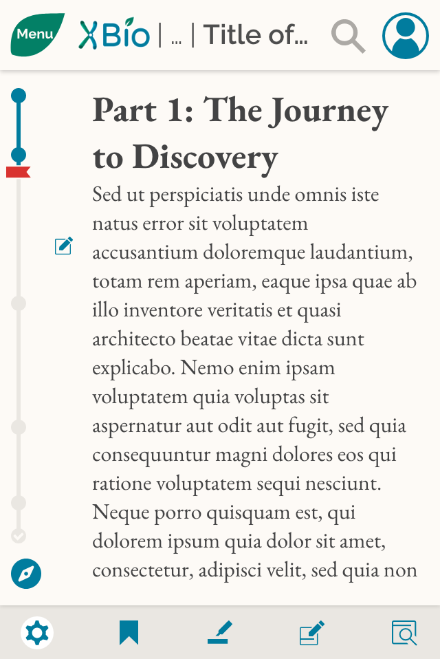
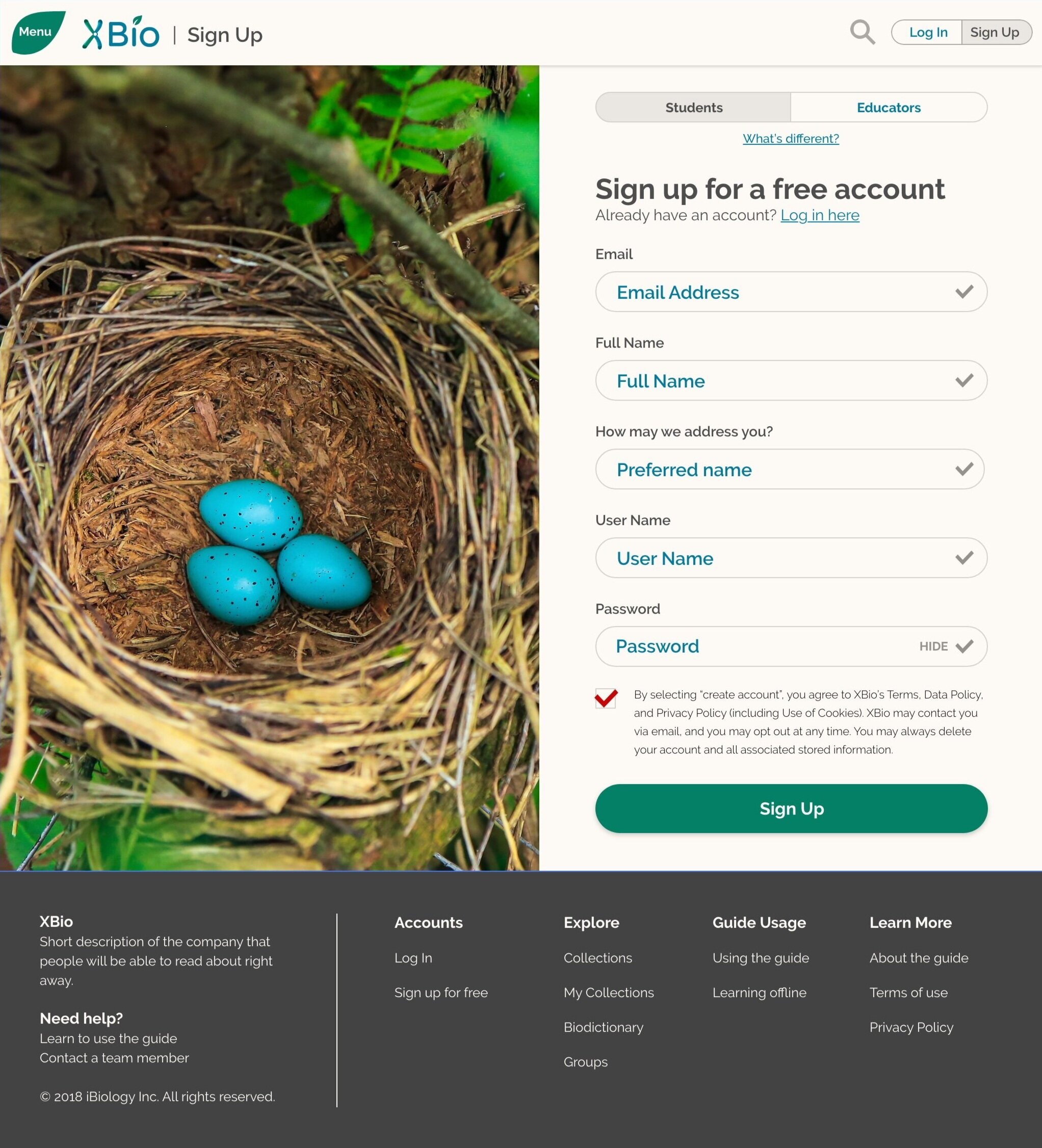
One of the first mockups for the reader Jimmy ever created for XBio. This was made before we had developed any understanding of a visual style for XBio. Also note the pagination—this mockup was created before the XBio team had decided to commit to a vertical scroll, and was still considering a paged UI.
A mid-to-late iteration of the reader mockup. Note the structural changes—this was made with a later wireframe. This general visual style was a response to my feedback to hew closer to a flat, less skeuomorphic design. Also note that we had, by this time, developed a coherent, WCAG-compliant color scheme.
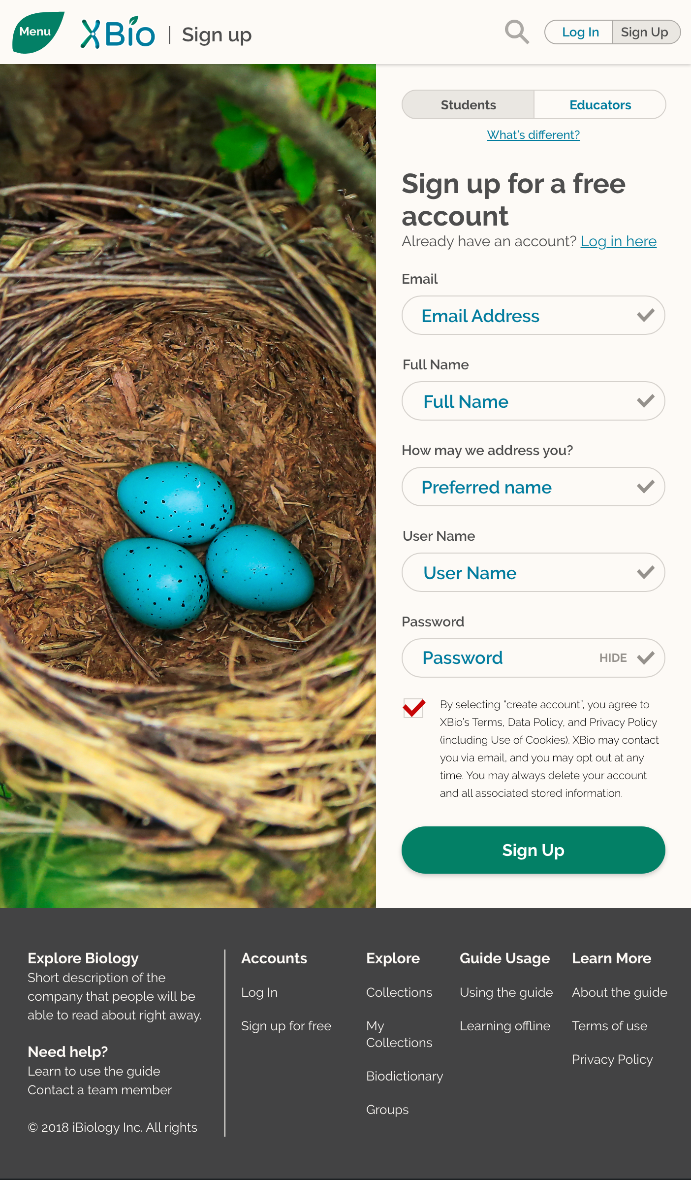
The final reader mockup.
Color Matrix for XBio
A Note on Accessibility:
Accessibility was an important factor for this project, and color contrast is an important element of accessibility guidelines. Throughout the mockup iterations, Jimmy and I converged upon a WCAG AA-compliant color scheme that was also deemed acceptable by iBiology stakeholders. I created this color matrix to demonstrate which colors could be used together, and in what context they could be used (for instance, in large text only):
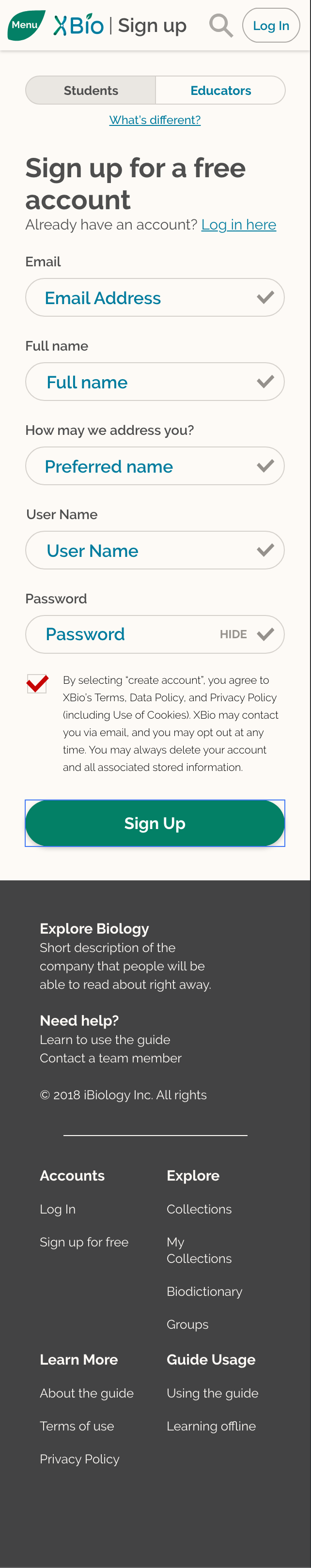
Finally, I take the visual design and apply it to smaller screen sizes:
The website was expected to be fully responsive, so I needed to deliver mockups of desktop/laptop, tablet, and mobile sizes to the TNQ development team. Once Jimmy and I had converged upon a final mockup, I translated the visual design Jimmy had created to a smaller screen format. These screens were then forwarded to the TNQ development team:

Developer Feedback and Changes
Although I had been in contact with the TNQ development team throughout the wire-framing and mockup process, stakeholders higher in the TNQ organization were only apprised of the design work later in the project. These stakeholders voiced concerns about certain design choices in the context of development resources and needs, and began to request design changes. Given the breadth of the requested changes, the practical difficulties of communicating regularly with TNQ (TNQ technologies is located in India, introducing time-change complications for regular meetings), and the lack of slip remaining in our release schedule, the founder of The Explorer’s Guide to Biology and I requested that TNQ take the design materials I had provided thus far and develop a set of mockups reflecting the functionality that they were willing and able to develop.
These TNQ mockups went through another set of design iterations with me and the XBio founder in order to ensure that they supported the functionalities we felt were non-negotiable, met accessibility requirements, and did not wildly eschew usability heuristics. TNQ did not design with screen size responsiveness in mind, so once we had settled on an acceptable design it was necessary for me to mock-up tablet and mobile versions of each screen as well. A final mockup (now in production) designed by TNQ and iterated upon by the XBio Founder and me is shown here, including the tablet and mobile versions I designed to enable responsive viewport sizing:
Launch and Future Evaluative Research
The Explorer’s Guide to Biology launched publicly on October 1st, 2019 at explorebiology.org. Since the launch, XBio has garnered both educator and student registrants from around the world. Before leaving the service of XBio in June 2020, my final central responsibility in this project was planning and undertaking evaluative research on the platform and content.
Mixed-Methods Evaluative Research
Approximately 70 of XBio’s registered educators volunteered to take part in mixed-methods evaluative research efforts. Additionally, these educators connected the XBio team and me with hundreds of current biology students, some of. which are already using XBio in their classes. Both user populations, students and educators, were asked to take part in separate surveys focused on feature use and satisfaction for XBio. Additionally, some students and educators opted-in to take part in in-depth, qualitative one-on-one interviews.
The data from these surveys were statistically analyzed and interpreted in conjunction with the qualitative findings from the in-depth interviews. Thirty-two separate research findings were detailed in a fifty-one-page final report delivered to the XBio Director on 6/12/2020.
Reflection
Working with iBiology, TNQ Technologies, and the rest of the XBio team has been a huge privilege. The importance of creating a free, accessibility-centered tool for education has made this an immensely fulfilling project to work on.
As a designer, this project was also immensely challenging. Due to the early stage nature of the project, the structure of XBio could shift very quickly in the face of an important stakeholder opinion or some other force. I had to be nimble with my design work, clear with my design priorities, and ultra-communicative with my team members. This went very well with Jimmy—we worked together well and made a good team. I think stronger communication with the TNQ development team, however, may have been able to mitigate the late-stage design shifts. This has been an important lesson for me: I must work to ensure I have buy-in from every member of the the project team, not only those I perceive as in charge.
The canonical design process was also challenged quite heavily in this project, as time and resource pressures made it impossible to bring the user into the UI design iteration. While I made a concerted effort to bring learnings from my initial research into my wireframes, there is no substitute for a usability test. As a designer, however, I must design within my practical constraints, and initial positive responses to the resource and website suggest that we did not end up too far from the mark.